How to Make an Author Website Part 5: Purposeful Design and prettylinks
Why you need a neat and pretty website
A well-designed site that’s nice on the eyes is as important as the content on the site. It’s all about inspiring confidence in your reader, with you and with your site. The reader will be more inclined to read what is on your site when the site looks well-designed and is pleasing to the eye.
Think of times that you landed on the site and thought immediately what the site is not good. More often than not, you bounced right off into another direction looking into some other sites that were better designed. Remember that your readers are scrolling with Cheetos-crusted fingers. By looking at them in that way you know immediately when your reading level is too high or if your site is too cluttered.
You can, of course, do whatever you like. There are no rules on the Internet, only guidelines. Be aware though, that some readers will decide that your content is not worth the effort digesting if it’s too obscured through tough language and sub-optimal design.
So how do we fix that?
Firstly, think of your favourite websites. How they look and how they handle. Browse around, see what you like what you don’t like and to make a list. This is the list of stuff that you’re looking for when you’re making your website.
In my opinion clean one column sites look and handle the best. This causes the fewest distractions to the reader by the way of sidebars or neon flashing buttons from the late 90s which threatened to blind your reader to your content.
That being said, if you look at my websites, I generally have stuff in my sidebars. But each of those things I deliberated at length before putting there. That’s what you need to take into consideration when potentially distracting your reader. Make sure that what is on your site is in line with your goals for your site. Rule of thumb is, only one action for the reader to take per page. If you want a reader to buy your book from this page, avoid putting mailing list sign ups on there. If the purpose of the page is to get her e-mail address for your list, don’t put buy now buttons everywhere.
Secondly, use the list of stuff that you liked and didn’t like on other sites to find a new theme. With your list, it will be a lot easier to narrow down potential themes. As I mentioned in the video the generic themes, twenty-twelve through twenty-fifteen, have the most utility in them. For someone new to the game, faffing around with these before you start buying themes might be a good idea. They are basic enough to be easy to grasp but flexible enough to do really interesting things with. Go ahead and see what works for you.
Once you have some good content on your site have a theme looking good, you will be tempted to clutter the hell out of your sidebar. Trust me, they appear as if by magic, like roadblock cops after a night out. They can take the form of Facebook like boxes and tag clouds (heavens forbid), but also useful stuff like email list opt-in boxes. Be very careful before selecting any of these. The only exception I would make is if you have a lead magnet attached to your email list sign-up form, as this is usually the main purpose of an author website.
That is the key really. Every single element that you include on your website must have a clear purpose. If it does not match that’s purpose then you are distracting readers with shinies. They may not have enough attention span left to remember to go back to your site after liking your Facebook page.
Remember the purpose of your website: You are an Author.
As an author what are you looking for? Book sales? Mailing list subscribers? Lifelong true fans? To be honest, you’re looking for all of these things. But some of these things link into each other in a way that may not seem obvious to begin with. As an author, you are looking for your 1000 true fans. These are the guys and gals that will pretty much buy anything you come out with and defend your name on social media. You get them by allowing them to know, like and trust you. The surest way to do that is by getting them subscribed to your mailing list and then building a relationship with him through e-mail. That’ll result in book sales because they will now know like and trust you and would want to support you. See Tim Grahl’s book, Your first 1000 copies, for more information on how to do this.
So what’s the purpose of the website?
It’s to get those lifelong true fans. That is all. Your content’s only purpose in life is to entice readers to become fans. It is a place for readers of your books to have a source of information. All it is is a place to get mailing list subscribers that you control. It is up to you to turn a small percentage of these subscribers into lifelong true fans by being authentically you, cranked up to 11, in their general direction. Some will be turned off by you being you, but you don’t need those. You’re looking for the ones who bask in your authentic weirdness.
Can you do this without a website?
You can, but it’s hard as hell. It’s like trying to build a sand castle below the high-tide mark. Remember MySpace? Me neither. I feel sorry for those who put huge amounts of work into that platform. Platforms that you do not control can be destroyed in a moment’s notice when that tide comes in, on the whim of fickle social opinion or the owner’s needs.
Another strike against social media is that talking to your fans is like shouting at people from across the busy street while they’re still eating Cheetos and watching Die Hard. Not ideal. On a website, you can at least control the environment to a degree and have higher odds of getting those true fans on to your list. After that, e-mailing your fan is like whispering into his ear from across a pillow. Lovely.
Prettylinks
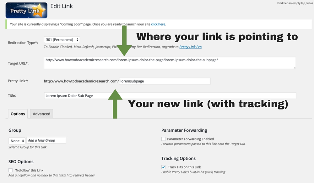
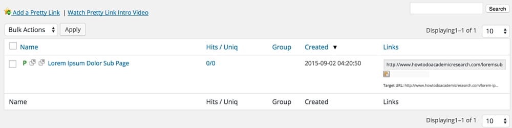 In an effort to make things look as pretty as possible, I suggest you use Prettylinks to make your affiliate and outside links seem less horribly convoluted. It’s relatively easy to use, luckily. All you need is the target URL on the page or site that you’re pointing to, and an idea of what name you want to call the link, and pretty links will do the rest. Now if you paste the naked link into your page, it looks like http://www.yoursite.com/prettylinkname instead of http://www.somesitenameoranother.geocities.com/cgi-bin/blearch-moomin/?_page42.